Intro
Problem Context
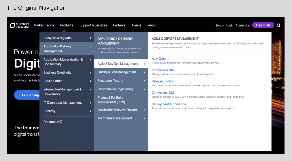
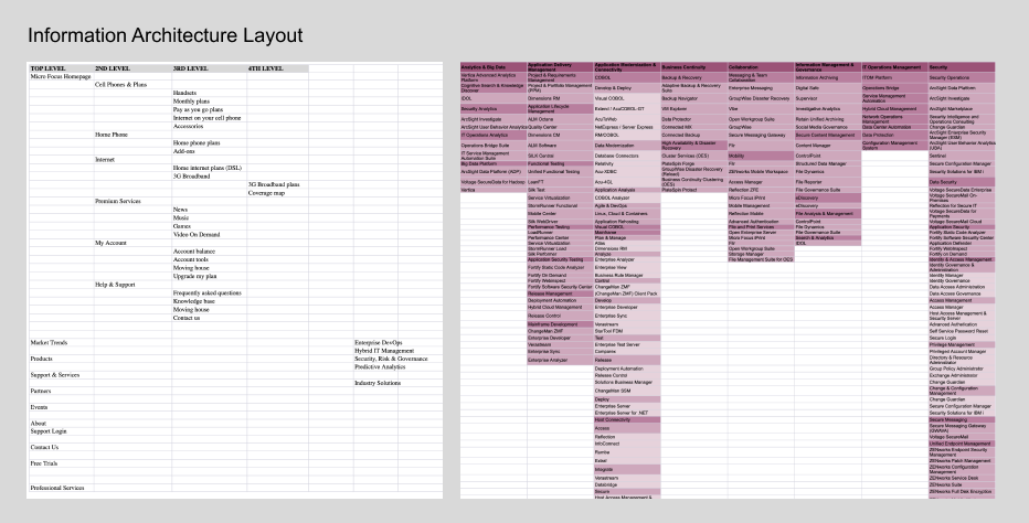
The site’s navigation suffered from several issues within its information architecture and interface design, impacting usability and user comprehension.
Information Architecture Issues:
The navigation structure included “Market Trends” and “Products” as major sections. However, the “Market Trends” section only covered four solution groups, failing to provide a clear representation of the complete product portfolio. Meanwhile, the “Products” section intended to list only products but included a mix of products and solutions, leading to confusion. Additionally, the use of internal-facing terminology for product groups and portfolio names was not user-friendly, making it difficult for external users to understand. Furthermore, repetitive information was presented under the same group, creating unnecessary redundancy and overwhelming users.
Interface Design Challenges:
The interface was overly complex, requiring users to navigate through a total of four tiers to access individual products. This tiered structure demanded users click through both the product group and portfolio levels to reach their desired information. Moreover, the portfolio tiers compounded the confusion by listing both functional groups and products together. The “click-to-expand” functionality added further friction by hiding critical content at each tier, leaving users unsure of what information was available without excessive clicking.
These combined issues hindered the discoverability, clarity, and overall user experience, emphasizing the need for a streamlined and user-focused redesign.
Data Proven
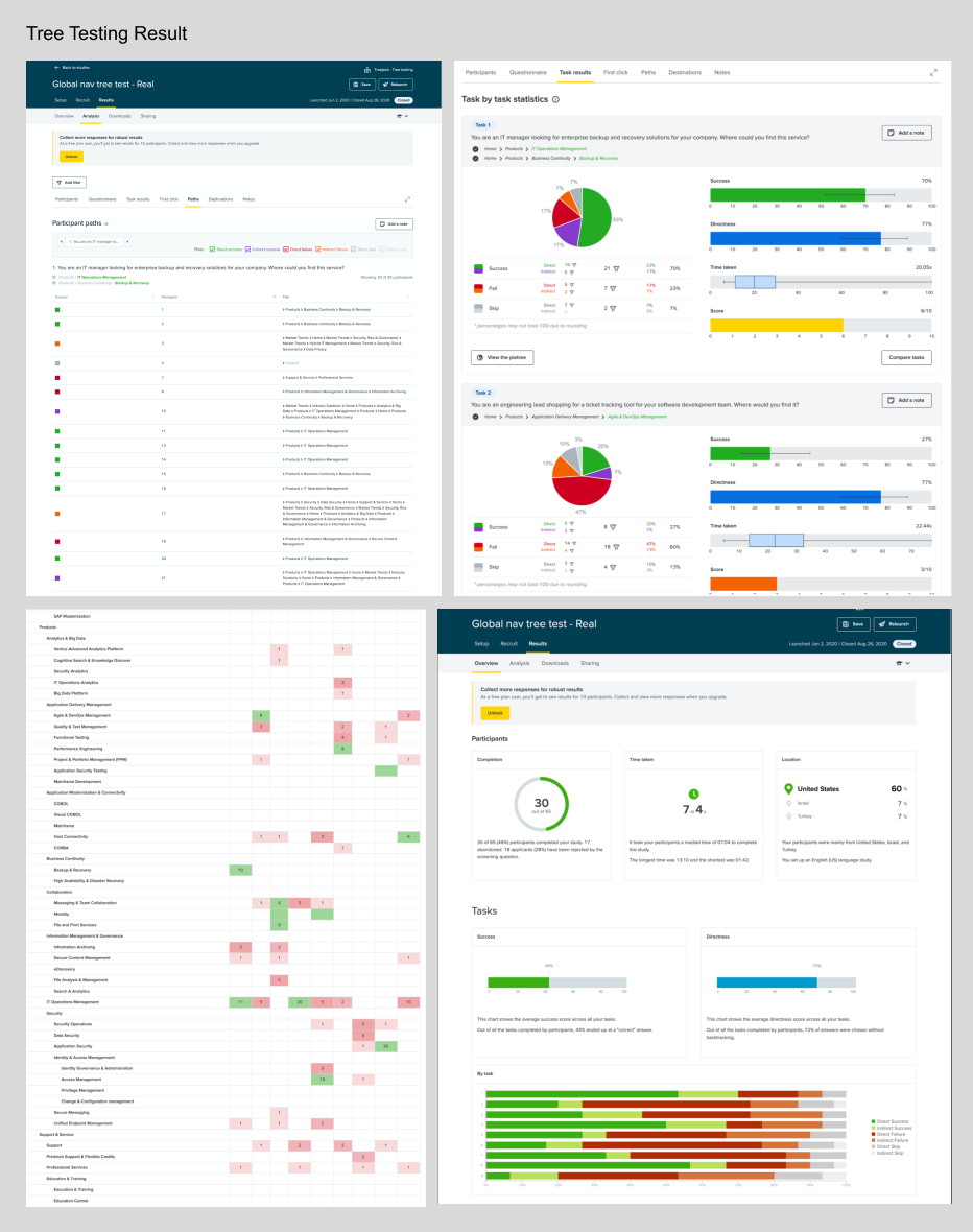
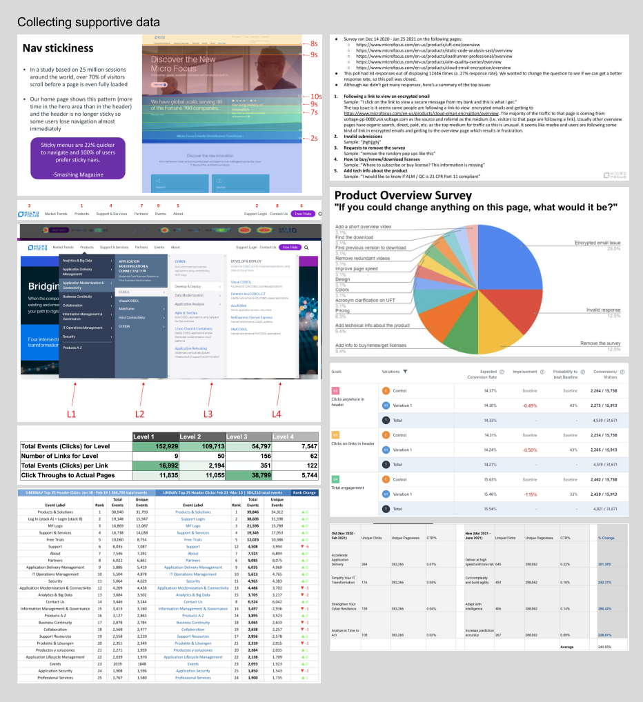
While the primary UX issues with the navigation were evident, user testing was essential to pinpoint specific pain points and gather data to substantiate the necessary improvements. To address this, I conducted a Tree Test using Optimal Workshop.
I designed several user-friendly, non-technical tasks simulating real-world scenarios, requiring participants to locate a specific product within the navigation. This approach ensured the test was accessible to a diverse audience while accurately reflecting user challenges.
The results revealed that only 30% of participants successfully located the correct product. A significant number of users frequently backtracked between the Product Group and Portfolio levels, struggling to identify the appropriate category. This behavior highlighted a key problem: the grouping names were unclear and insufficiently descriptive, causing confusion and forcing users to navigate back and forth in search of their desired product. The data provided strong evidence that the navigation structure and labeling needed to be rethought to improve clarity and user flow.
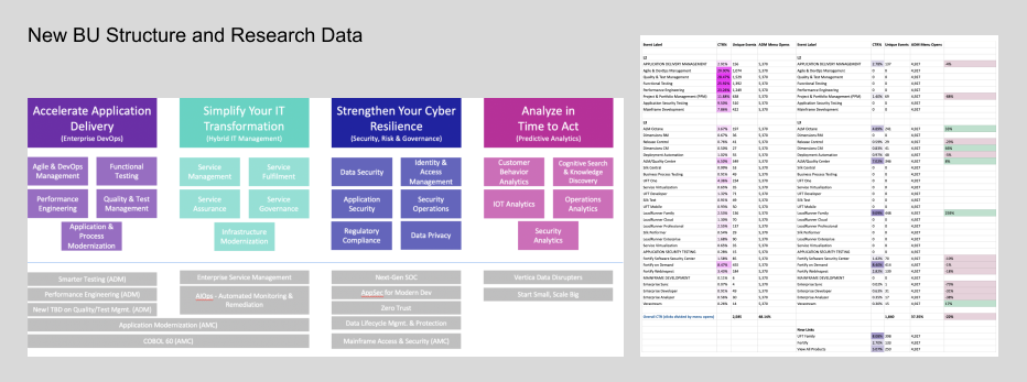
New Marketing and Business Unit Architecture
With the introduction of a new marketing messaging hierarchy from the company, I collaborated closely with key stakeholders, including the Chief Marketing Officer (CMO), Head of Product and Engineering, and Product Managers, to identify and prioritize areas for improvement. This cross-functional partnership ensured that the redesign of the navigation aligned with both strategic business goals and user-centric principles.
To start, I conducted a detailed audit of the existing information architecture (IA), mapping out the structure and identifying additional issues beyond those previously surfaced. By analyzing the navigation in the context of user data collected through testing, I highlighted specific problem areas that required restructuring. This included identifying inconsistencies in categorization, redundant groupings, and unclear labeling that contributed to user confusion.
Using this insight, I created a prioritized action plan, outlining key fixes and opportunities for improvement. Working iteratively, we held biweekly workshops to reimagine the IA. These sessions involved brainstorming, testing potential solutions, and aligning the navigation structure with user expectations and the company’s updated messaging strategy. The collaborative process ensured that the revised IA was not only streamlined and intuitive but also reflective of both user needs and business priorities.
Key Challenges
Redesigning the site navigation presented significant challenges from a UX perspective, primarily stemming from organizational practices and misaligned priorities. Below is a detailed breakdown of the challenges faced:
1. Siloed Product Groups and Lack of Goal-Oriented Information Architecture
The business structured individual Product Groups independently, leading to a fragmented approach to the overall information architecture (IA). Without clear, shared goals guiding the IA design, each group developed their sections in isolation, resulting in a disjointed user experience. The lack of a cohesive strategy made it difficult to create a unified navigation structure that reflected the company’s offerings in a logical, user-centric way. This siloed approach also caused overlaps and inconsistencies in the categorization and presentation of information.
2. Use of Internal-Facing Language
Each Product Group was heavily attached to their own internal naming conventions, which were not intuitive or meaningful to end users. This internal-facing language created a significant barrier for users, as the labels and terminologies used in the navigation did not align with how users naturally thought about or searched for products. This challenge highlighted a gap in understanding between internal stakeholders’ language and the users’ mental models.
3. Limited Understanding of User Needs and Perspectives
The navigation design process initially lacked a user-centric approach, with minimal research or empathy for how users would interact with the site. Decisions were often made from an internal perspective, focusing on organizational priorities rather than user workflows. This lack of user insight meant that the navigation structure failed to address key user pain points, such as discoverability, clarity, and ease of navigation.
4. Fragmented Ownership and Inconsistent Navigation Design
Each group owned a portion of the navigation and managed it independently, which led to significant inconsistencies across the site. This included differences in labeling, categorization, and the overall structure of navigation paths. The absence of a centralized ownership model or a set of design guidelines resulted in a navigation system that lacked coherence, making it harder for users to predict and find the information they needed.
These challenges required a balance of strategic collaboration with internal teams and a focus on user needs. Resolving these issues involved not only redesigning the navigation but also fostering a cultural shift toward user-centered thinking. By integrating user research, aligning internal stakeholders, and prioritizing consistency and clarity, the navigation could be transformed into a more intuitive, cohesive, and goal-driven system.
Objectives and Strategy
Redesigning and restructuring the global navigation for the site involved several goals that, while seemingly straightforward, became increasingly complex due to the number of stakeholders and the scope of the project. Below is a detailed explanation of the goals and how they were approached from a UX perspective:
1. Managing Complexity Through a Phased Approach
Given the significant scale of the project and the involvement of multiple groups and stakeholders, the first goal was to break the redesign into manageable steps. This phased approach allowed the team to focus on one aspect of the navigation at a time, ensuring that each stage was thoroughly considered, tested, and aligned with both user needs and business objectives. By tackling the redesign incrementally, the project maintained clarity and reduced the risk of overwhelming the team or introducing inconsistencies.
2. Increase Real Estate with Mega Navigation
One of the primary goals was to increase usable screen real estate by implementing a mega navigation. A mega menu allows for a broad and shallow structure, providing users with a clear, at-a-glance overview of available categories and subcategories. This design approach reduces the need for excessive scrolling or deep navigation paths, improving usability and efficiency. The challenge here was organizing a large volume of information in a way that was intuitive and prevented cognitive overload for users.
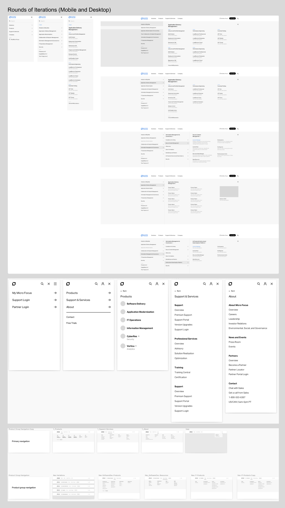
3. Simplify Tiers and Layers in the Structure
The original navigation had multiple tiers, often requiring users to click through three to four levels before reaching their desired information. The goal was to simplify this by reducing the number of layers, consolidating redundant categories, and streamlining the paths users needed to take. A flatter hierarchy improves accessibility and allows users to find what they need more quickly. This required extensive user research to understand how users navigated the site and the most logical ways to group and present information.
4. Simplify Descriptions
The original navigation relied heavily on long and overly detailed descriptions, which overwhelmed users and made scanning difficult. Simplifying descriptions meant rewriting labels and content to be concise, user-friendly, and actionable. This effort aimed to align with best practices for web content, ensuring clarity and readability while maintaining essential context. The challenge was striking a balance between brevity and providing enough information to guide users effectively.
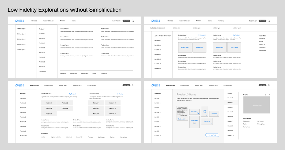
5. Redo Information Architecture for Products
The information architecture for the Products section required a complete overhaul. The original structure mixed products and solutions, creating confusion for users trying to locate specific items. The goal was to create a dedicated product taxonomy that logically categorized products based on user mental models and search behaviors. This redesign focused on ensuring discoverability and clarity while aligning with business goals and the company’s updated messaging strategy.
6. Redo Information Architecture for Solutions
Similarly, the Solutions section needed a distinct and user-friendly IA. This required separating it from the product offerings and organizing it in a way that reflected how users approached solution-based queries. For instance, solutions could be grouped by industry, business challenges, or use cases, depending on what resonated most with target audiences. The challenge here was ensuring that the solutions structure complemented the product navigation while avoiding redundancy or confusion.
The overarching goal of the global navigation redesign was to create a user-centric, scalable, and intuitive navigation system that balanced the needs of users and stakeholders. By increasing real estate, simplifying the structure, improving content clarity, and rethinking the information architecture for both products and solutions, the redesigned navigation aimed to deliver a seamless experience that enhanced usability and supported business objectives. Each step required collaboration, user testing, and iterative design to ensure the final solution met the needs of a diverse user base while addressing the complexity of the organization.
Reality, First Version and Obstacles
The goal for this project was ambitious: to deliver a fully redesigned navigation system encompassing information architecture (IA), UI, and UX within the constraints of a strict timeline. While I had a clear plan, defined pipelines, and KPIs to guide the process, progress was slowed by the complexity of collaborating with multiple groups, each with differing priorities and objectives.
As part of the iterative approach, we identified the Portfolio level as the primary pain point and prioritized testing its removal. However, during this process, two groups proposed adding an additional layer beneath the Portfolio level, which would have resulted in a five-tier navigation system—further complicating the user experience. Resolving this misalignment required escalating the issue to the global CMO to ensure the project stayed aligned with its user-centric goals.
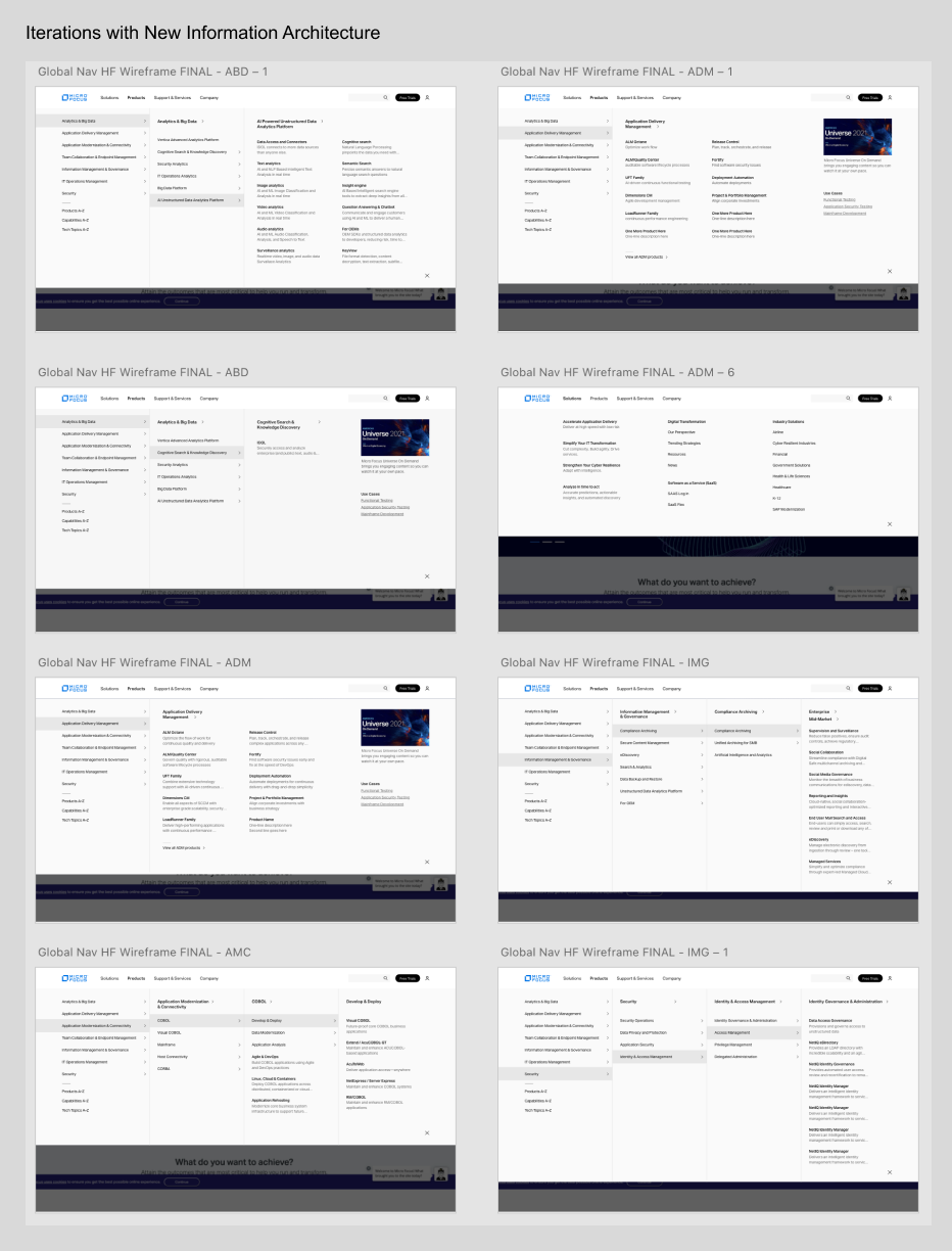
Over nearly two years, the project underwent numerous changes and adjustments. Despite the challenges, we successfully completed the first step of our plan: eliminating the Portfolio level and streamlining the navigation to focus on the top ten products. This milestone marked a significant improvement in simplifying the user journey and addressing core usability issues.
Objectives and Strategy
First Version:
- Remove portfolio level
- Simplify product description
Problems:
- Portfolio pages are not accessible from the nav
- Listed products and solutions together
- “View all products” listed as product with no differentiation
Reshaping UX Processes Amid Organizational Change
At the beginning of 2021, Micro Focus underwent a significant global reorganization, which resulted in the UX design team transitioning from the Engineering department to the Creative/Graphic team. Despite this shift, I maintained my responsibility for overseeing major UX initiatives, including the Global Navigation (Nav), My Micro Focus Dashboard, and the Community Forum. Throughout this period, I remained committed to managing these projects by adhering to well-established UX methodologies, rather than adopting a more traditional graphic design-centric approach, which was the new focus of the Creative team. However, navigating these changes and maintaining the integrity of the user experience discipline in the face of shifting priorities presented several challenges.
As the Creative team adopted a different management structure with a more visually-driven focus, it became clear that my primary goals needed to be realigned with both the new team dynamics and the evolving needs of the business. One of the key objectives I focused on was refining the global navigation structure, ensuring the reintroduction of the "portfolio" level. This enhancement was informed by user testing and research from the initial design, which identified key pain points in usability. Organizing the content into more intuitive, functional categories was essential in order to align the product’s design with the users’ needs and expectations, rather than adhering solely to aesthetic preferences.
To overcome resistance and bridge the gap between UX and the Creative team's traditional practices, I strongly advocated for implementing robust user testing processes—a practice not previously established in the Creative team’s workflows. Introducing this approach was pivotal for fostering a data-driven culture within the team. By conducting iterative user testing and leveraging actionable insights, we ensured that our design decisions were informed by real user needs. This methodology helped mitigate risks of resource misallocation, reduced the potential for redesigns, and optimized time and costs in the long term.
Navigating these challenges during the company reorganization required not only technical expertise in UX research and design but also effective communication and stakeholder management. By demonstrating the value of a user-centered approach, I was able to help the team align with broader organizational goals while ensuring that UX remained a strategic asset in driving meaningful outcomes.
New Acquisition By OpenText
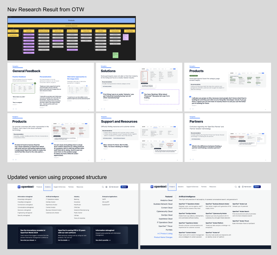
OpenText acquired Micro Focus in 2023, resulting in a pause and re-evaluation of most ongoing projects, including the navigation redesign initiative. This project was temporarily deprioritized as the company focused on migrating the two organizations' products and aligning operational priorities. Recognizing the critical importance of user experience in navigation performance, I took the initiative to gather and analyze the history of prior iterations, testing outcomes, and user feedback. I leveraged this data to build a compelling case for resuming the project post-merger.
The challenge was further amplified by the absence of established UX research practices within OpenText to support the navigation's performance assessment. To address this, I advocated for incorporating navigation research into a key milestone event—the Vegas event. Through strategic communication, I successfully demonstrated to stakeholders how user research could uncover actionable insights to drive business outcomes and improve usability. As a result, the team agreed to prioritize navigation research during the event, which enabled us to collect invaluable user feedback.
This effort not only validated the importance of evidence-based UX methodologies but also underscored my ability to align cross-functional teams with a user-centered approach, even amidst organizational shifts and competing priorities.
Other Projects
Use below links to explore Iris' other product design projects