Intro/Background
My Role
As a UX Designer on the Digital Web Experience team, I was responsible for managing and improving the full spectrum of website activities, encompassing user search, need identification, the sales journey, and post-sales support. I collaborated closely with stakeholders, Product Managers, and developers to establish project plans, define business and user requirements, and align on strategic goals.
My role involved conducting UX research and usability testing to gather insights, designing low- and high-fidelity wireframes, and developing interactive prototypes to illustrate and refine solutions. I also prepared final deliverables with comprehensive documentation to support implementation and conducted post-launch testing to identify opportunities for optimization, ensuring a seamless and user-focused experience..
Tools
Creative: Figma, Adobe XD, Sketch, Adobe Illustration, Adobe photoshop, After Effects
UX Testing & research: Google Analytics, Optimost, Clarity, VWO, Optimal workshop
Others: Jira, Confluence, Zeplin
Problem Context
About Business Structure
Micro Focus offered so many products that categorize in an internal facing names. Users needed to follow a predefined website flow to understand product offerings, contact sales for demos or trials, visit the marketplace for updates or version information, and log into the community for resources or support. This lack of a centralized, cohesive experience not only increased cognitive load but also led to inefficiencies and frustration, making it challenging for users to quickly find the information or support they needed.
Reframing the problem
How can we centralize user-product-experience and accelerate sales process? The goal was to create one platform for three main purposes
- Clearly view and manage products
- Easily access to trials and upgrade their products
- Easy access to respective product resources
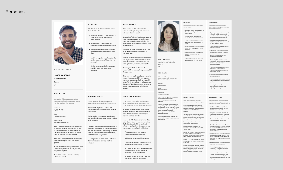
Users & customers
Current clients wants to
- Clearly view and manage products
- Easily access to trials and upgrade their products
- Product information in one place
- Find all product focus resources in one place
New users want to
- Clearly view and manage products
- Easy sign up and download trials
- Get to know product faster
Sales team want to
- More users to try or buy products
- Provide personalized and product-focus experience to users
- Help users to utilize products better
Understanding Products Management Applications
MF products are B2B and SaaS applications. SaaS product management applications are cloud-based tools designed to help teams efficiently plan, develop, and manage software products. These platforms provide centralized access to essential functionalities such as task tracking, backlog prioritization, roadmapping, and team collaboration. Users can log in via a web interface to access dashboards that display project updates, timelines, and performance metrics. SaaS applications integrate seamlessly with other tools like communication platforms, analytics services, and version control systems, enabling a streamlined workflow. Their cloud-native design ensures real-time updates, scalability, and ease of access, empowering distributed teams to stay aligned and focused on delivering high-quality products.
By comparing other product management applications, I identified a clear differentiation between their goals and the objectives of the MMF dashboard. Unlike those platforms, which often focus on narrow functionalities, our dashboard is designed to serve as a comprehensive "one-stop shop" that delivers a holistic experience from start to finish. This includes facilitating the initial product search, guiding users through the decision-making process, and providing robust support for after-purchase care.
A key challenge and opportunity for the MMF dashboard is its scope—it will effectively manage and categorize over 200 SaaS products. To achieve this, the design must prioritize an intuitive, professional UX that ensures users can effortlessly navigate the extensive product catalog. This includes features such as advanced filtering, tailored recommendations, and a seamless transition between product exploration and management tasks.
The dashboard will integrate user-centric design principles, leveraging insights gathered from research notes, graphs, and user personas. These insights will guide the categorization logic, layout structure, and user interaction flows, ensuring that the dashboard not only meets but exceeds user expectations. With a focus on clarity, efficiency, and user satisfaction, the MMF dashboard aims to set a new standard for SaaS product management platforms.
Designing the Dashboard
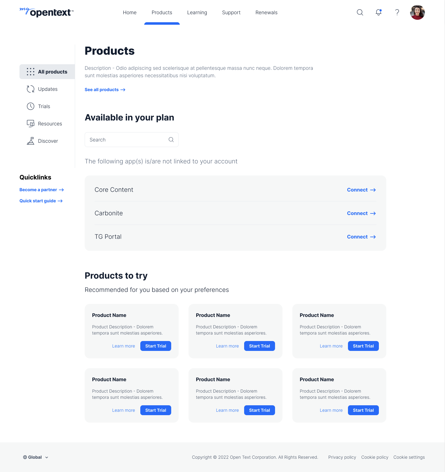
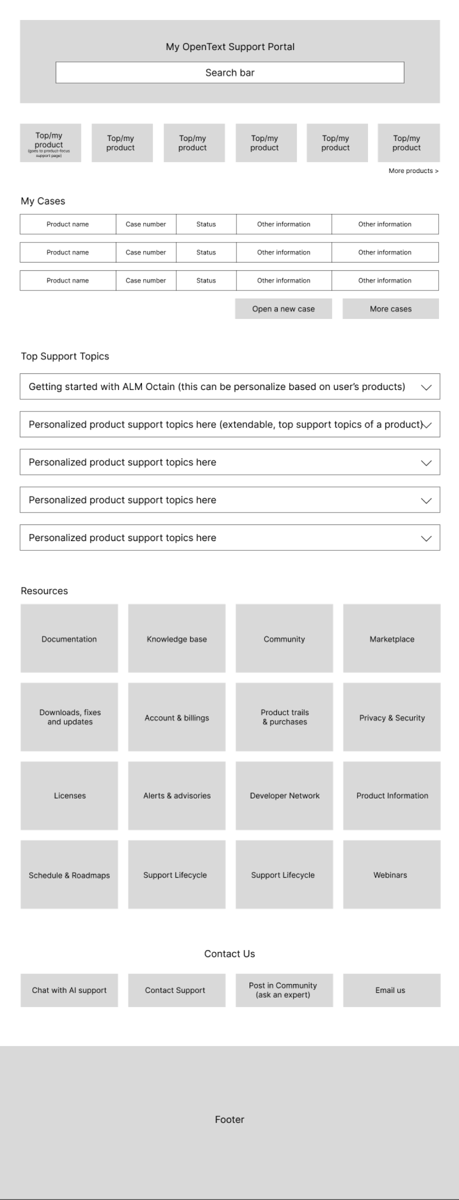
My main focus on designing this dashboard are focusing on simplicity, efficiency, and adaptability to diverse user needs. The interface should prioritize a clean and intuitive layout, allowing users to quickly understand workflows and access essential features like project timelines, task boards, versions and analytics. A modular design is crucial, enabling customization for various roles through personalized dashboards and views. What I want was a seamless navigation between different products’ new versions and features, also linked to how to use and feedback of this version/feature, such as connection between the dashboard to our marketplace and community forum. Accessibility and responsiveness across devices and platforms are essential, such as desktop, tablet and mobile. Mainly I focused on desktop-first because 92% of our users are desktop users. However, I still have compatible tablet and mobile design in each versions accommodate future changes.
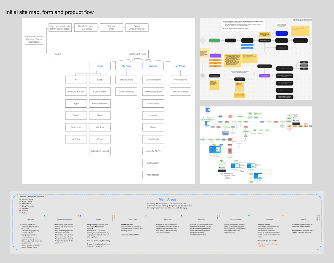
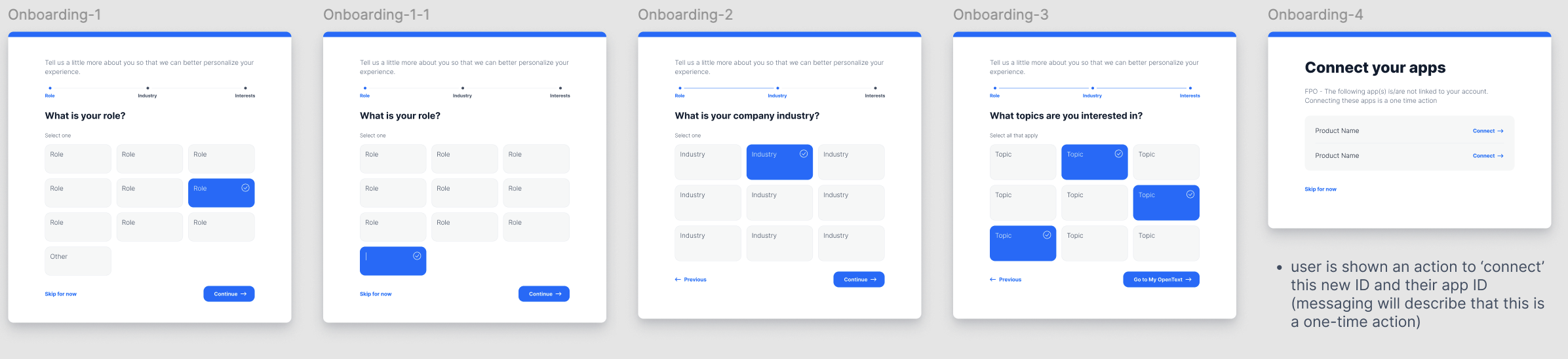
I also mapping out the basic step-by-step journey users take to complete key tasks. The process begins with identifying primary user personas (our current product users) and their goals, such as view all products they currently have, new updates and new feature of each product, coming up related events to them, product resources, and related supportive new products they could discover. Each step in the flow is represented visually, starting from entry points like login (ideally one login for all portals) to specific interactions such as manually adjusting favorite product, immediate update features, contact real-time product support (instead of bunch of supporting links), and more direct and define product resources and final outcomes. The chart has highlight decision points, alternative paths, and system responses to provide a comprehensive view of the user experience. Simplicity and clarity are paramount; labels, annotations, and intuitive symbols ensure the flow is easy to understand for stakeholders and team members. This flow chart helps identify potential bottlenecks, redundant steps, or confusing transitions, allowing for optimization before moving into wireframes or prototypes, ensuring a seamless product management experience for our clients.
Wireframing Process
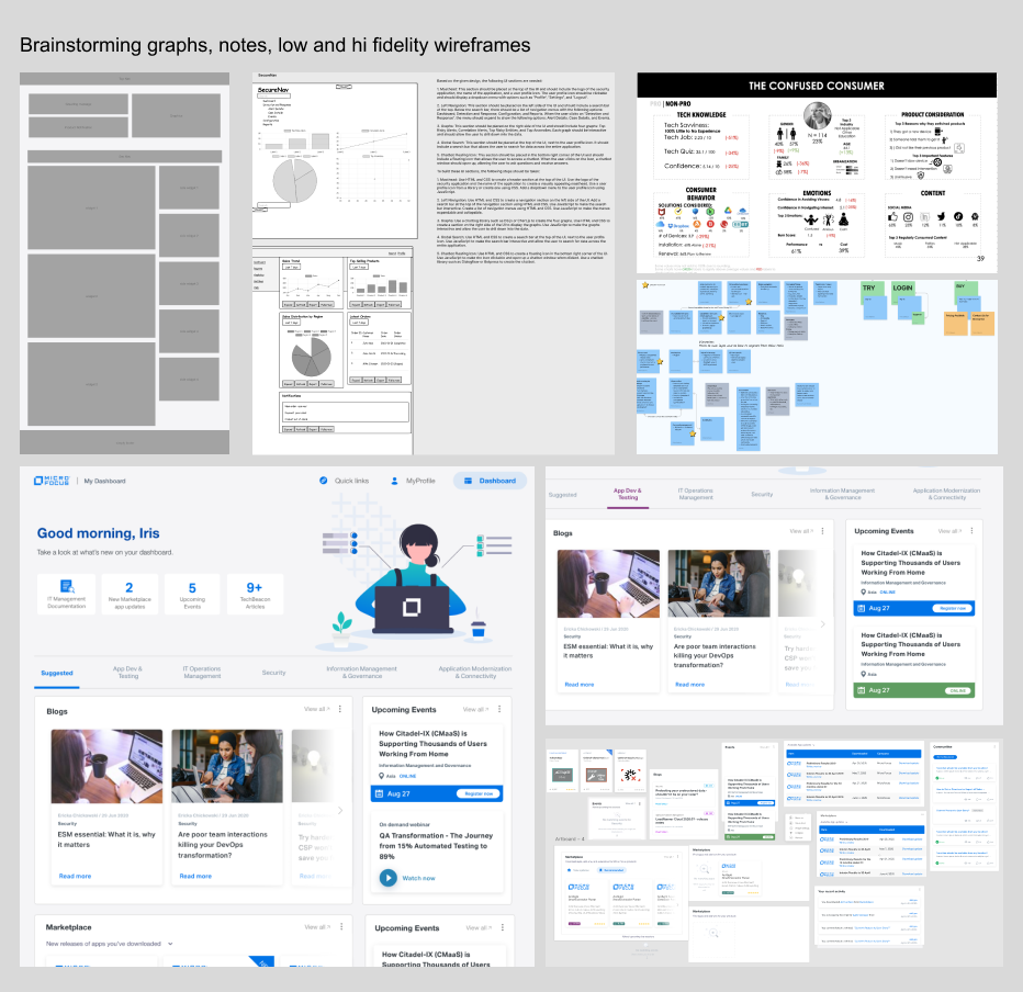
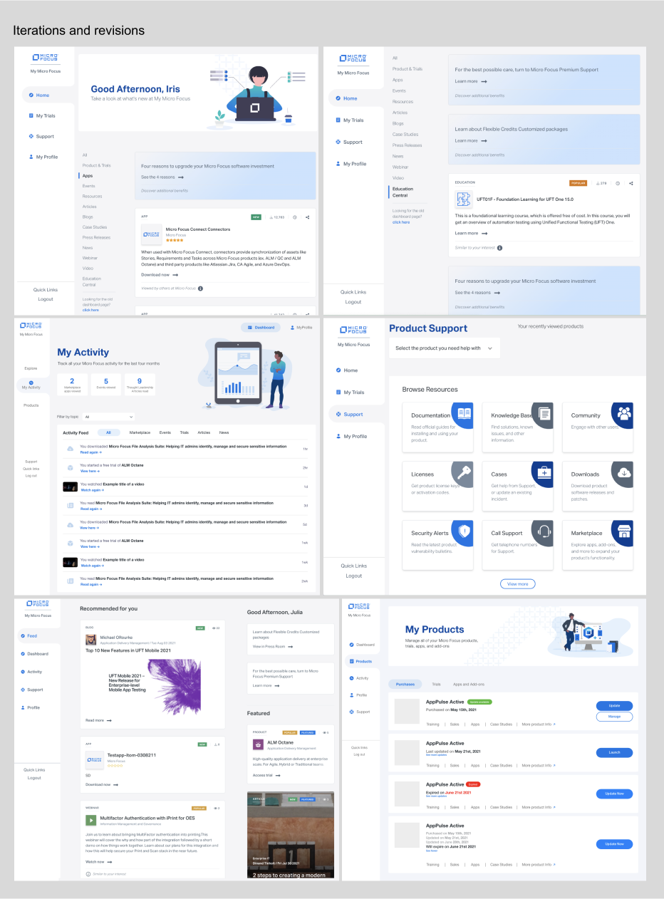
I began the design process by creating low-fidelity wireframes to establish the dashboard’s structure, layout, and core functionalities while intentionally deprioritizing visual details. Collaborating closely with the Product Manager and Product Director, I ensured the wireframes were scalable and aligned with potential feature expansions. Using basic design elements, I rapidly iterated on these wireframes, gathering feedback to refine the user flow and information hierarchy effectively. Once the foundational wireframes were validated, I transitioned to high-fidelity prototypes, incorporating brand visuals, graphics, and imagery. This stage focused on refining interactions, navigation, and content placement to provide stakeholders with a clear and tangible representation of the application's usability. To bridge the gap between design and development, I created interactive prototypes to clearly communicate transitions and workflows to engineers. Comprehensive usability testing, primarily conducted internally, was an integral part of the process. This testing helped identify and resolve issues prior to development, ensuring a seamless user experience. Through numerous iterations, the design evolved to meet stakeholder expectations while maintaining a user-centered focus.
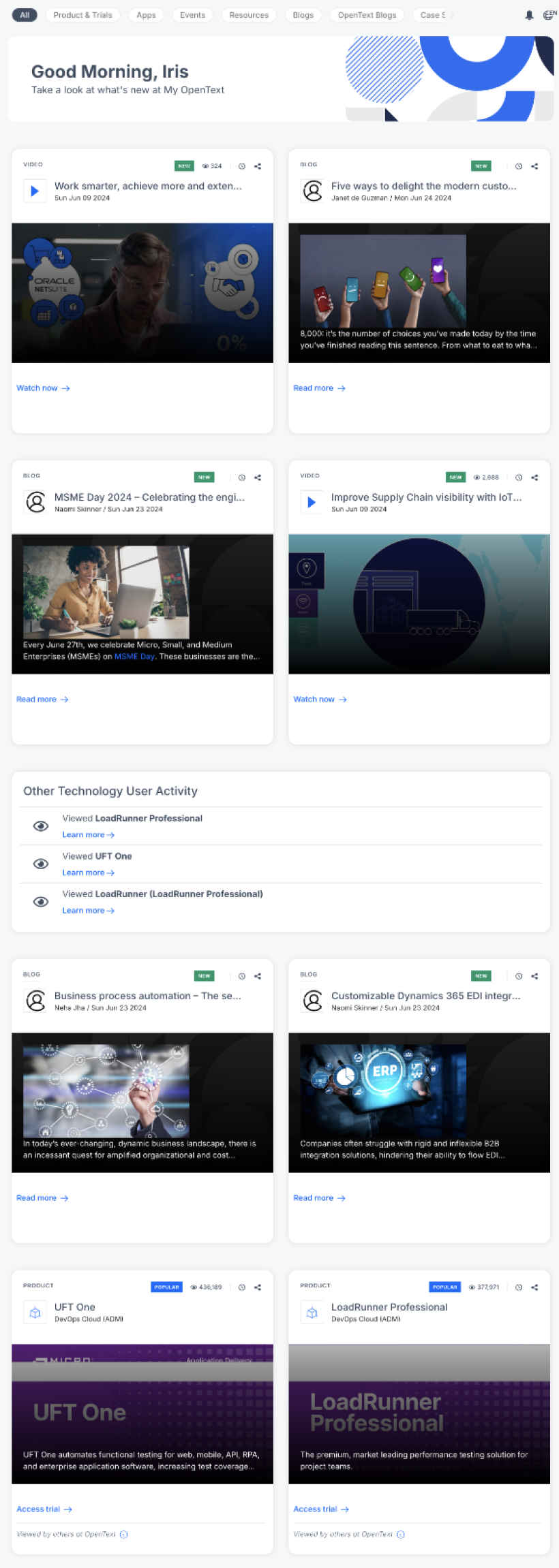
The initial design was developed to balance user needs and business objectives, featuring a notification banner that highlights four key focus areas tailored to user preferences. The goal was to provide users with timely and relevant updates on topics of interest, such as product information, application updates, upcoming events, and valuable resources. The main page was designed to be dynamic and user-centric, showcasing widgets based on user preferences. Users could customize their homepage by adjusting, rearranging, or selecting widgets to create a personalized experience. Additionally, a horizontal product group navigation bar was introduced to enable seamless exploration of product resources beyond their typical workflow, encouraging discovery and engagement with other offerings. This approach ensures that the design remains flexible, intuitive, and aligned with the evolving needs of the users while supporting broader business goals.
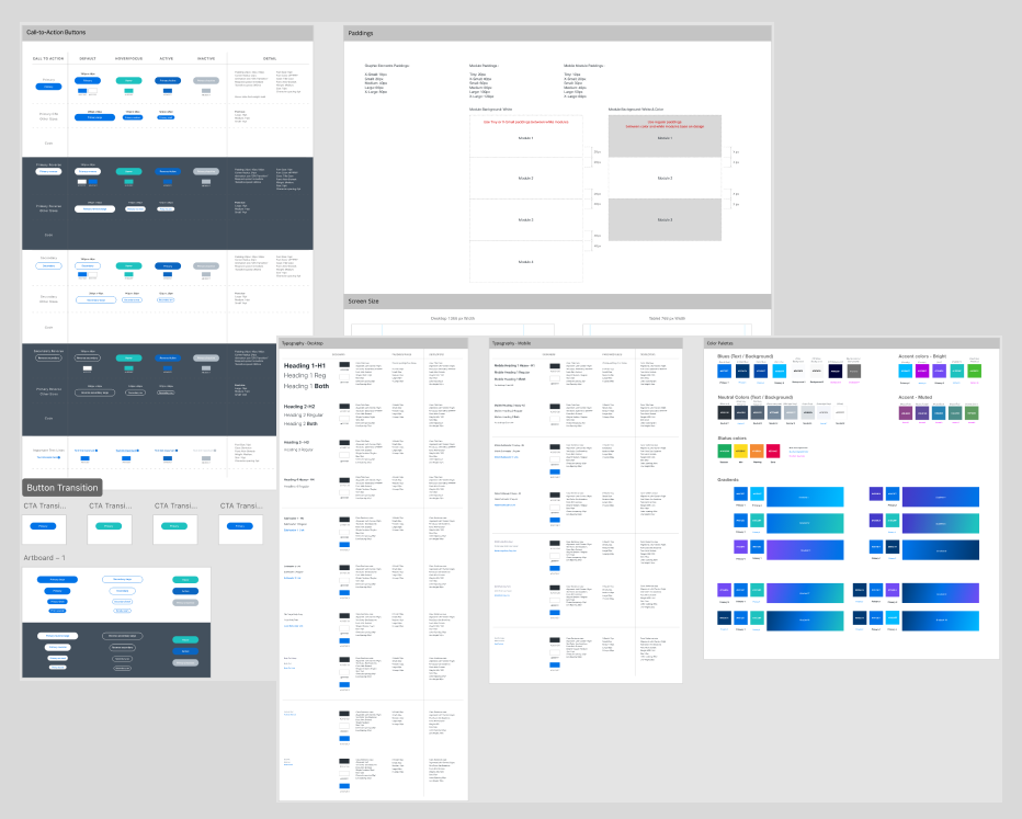
Dashboard Design System
I created a design system derived from existing styles used in the MF platform. The newest addition to the system were the colors for the rating scale. I chose colors based on contrast requirements and made sure to actively design within the latest WCAG standards.
Since this demo was going to be web-based, I pulled in existing brand guideline and involves translating the brand’s visual and conceptual identity into a cohesive, scalable framework for digital products. Start by extracting core elements from the guideline, such as color palettes, typography, iconography, and imagery styles, and adapting them for consistent use in UI components. Define reusable patterns, such as buttons, input fields, and navigation menus, ensuring they align with the brand’s voice and tone. Establish clear rules for spacing, grid systems, and responsive behaviors to maintain design consistency across devices. Also, I document these elements in a centralized, accessible repository, complemented by usage guidelines and examples. Collaboration with developers is crucial to ensure the design system is technically feasible and easily implemented. Iteratively test and refine the system based on feedback to ensure it effectively embodies the brand while meeting the functional needs of users.
User Testing and Iterations
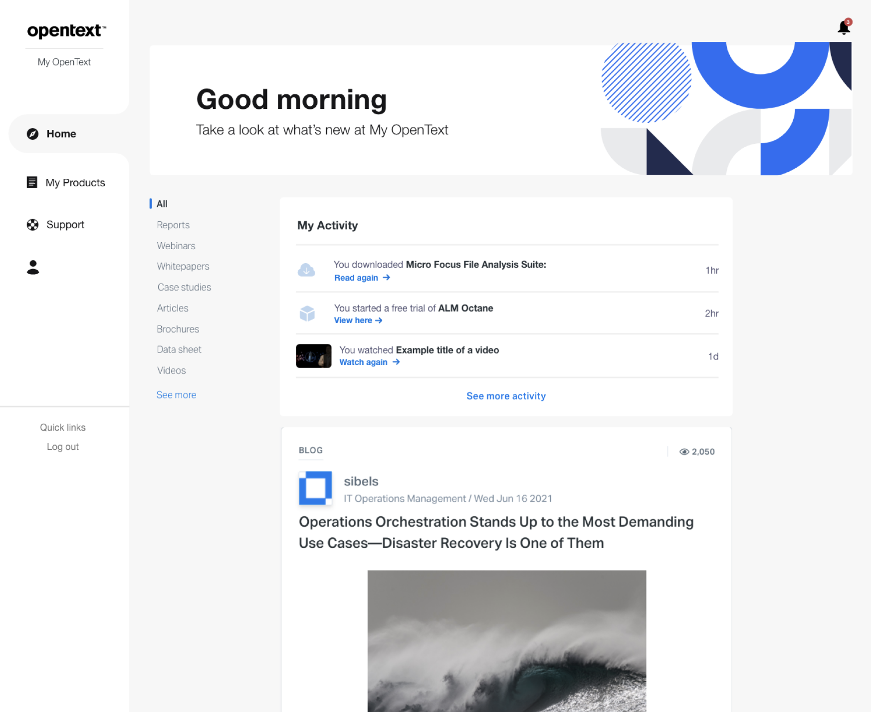
To ensure a successful initial launch, we conducted internal user testing with a group of highly active users from our community forums. These participants were experienced multi-product users and community knowledge partners, making them exceptionally familiar with our offerings. Their in-depth understanding provided invaluable feedback from a seasoned user perspective. For this testing, I utilized Adobe XD to create high-fidelity wireframes and prototypes with animations, ensuring the experience closely resembled the real dashboard. A total of 18 participants tested the dashboard, and the feedback was overwhelmingly positive. This success stemmed from conducting a user-needs survey prior to the design process. However, some insightful suggestions emerged during testing that required longer design and engineering development timelines. These ideas were prioritized and scheduled for phased updates post-launch.
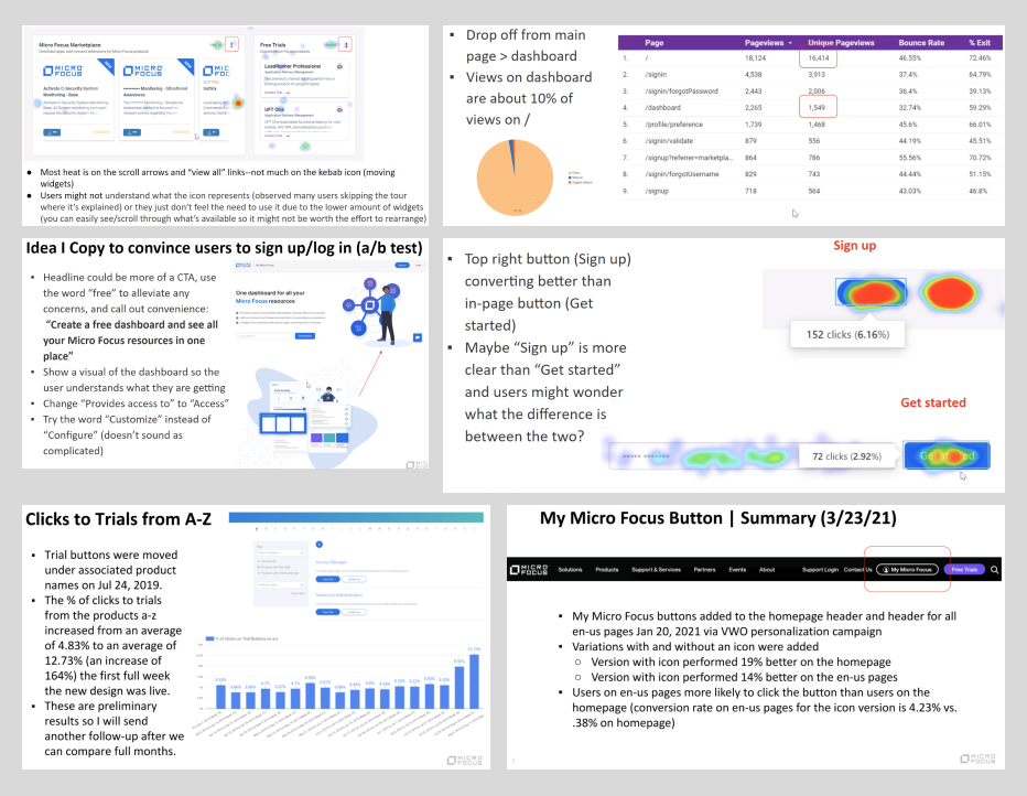
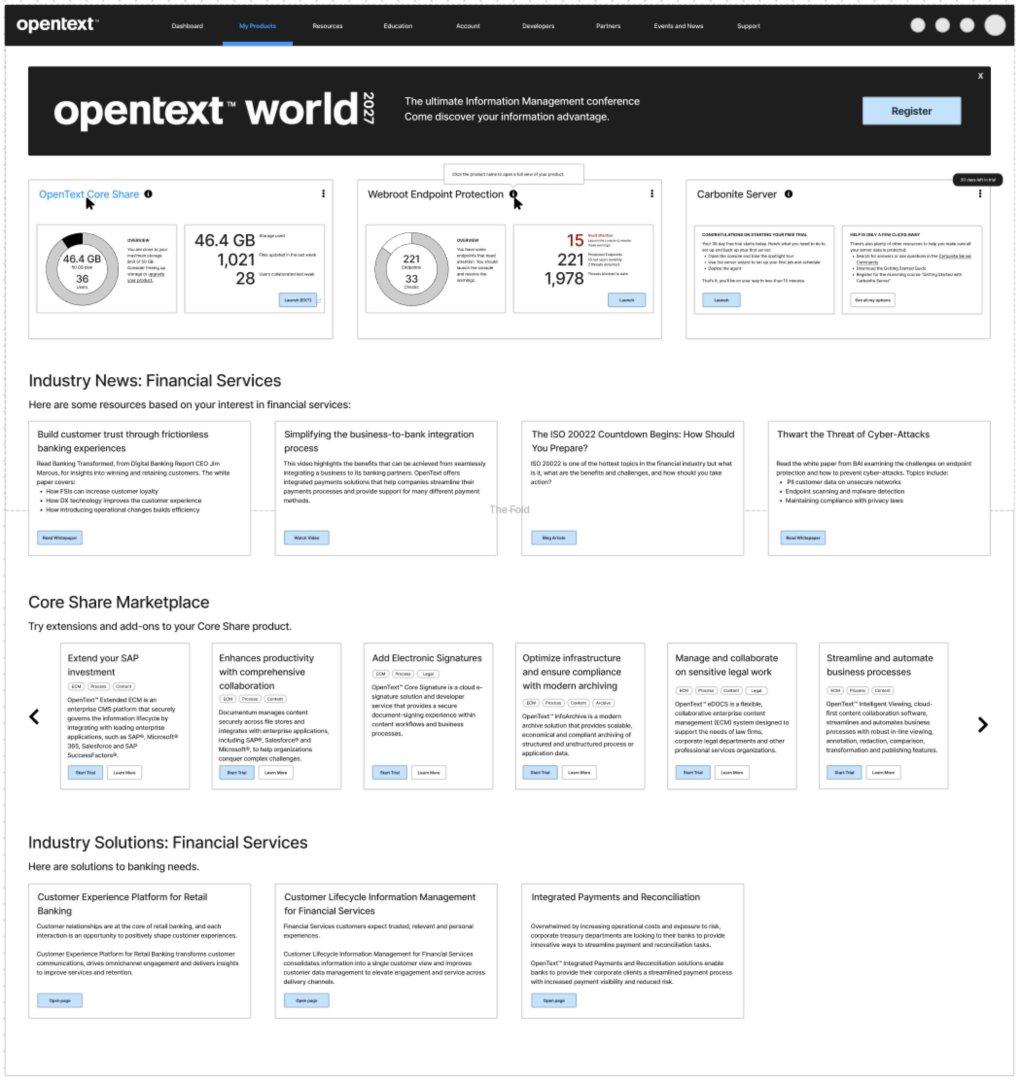
The initial dashboard design included a prominent banner at the top of the page to notify users about missed updates and changes within the application. The primary user flow was structured to guide users from the banner to subsequent sections. However, post-launch feedback and click-flow analytics revealed a significant deviation from the intended user journey. Many users found the banner unhelpful and space-consuming. Instead, their preference was to directly access detailed product resources without intermediary distractions.
In response to this feedback, we revisited the dashboard design to better align with user expectations. The banner was simplified and deprioritized, with numbering reminders removed to account for the extensive range of product groups. Additionally, we replaced horizontal tabs with vertical tabs to better accommodate the increased content and improve navigation efficiency. These updates reflect a user-centric approach, ensuring the dashboard evolves to meet the needs of our diverse user base.
New Insight & Constraints
Known Insights
- Customers want a dashboard that can view their application tracking system for features, updates and versions
- Customers want a chatbot that for extra help and information they could not find in the system
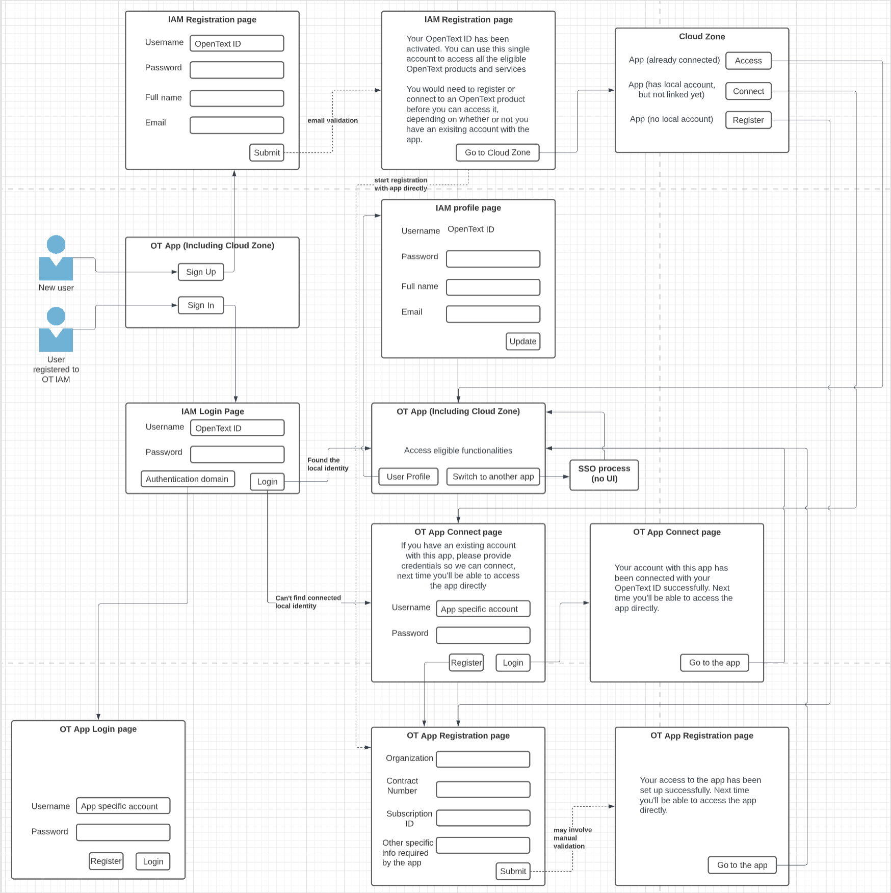
- Customers want a single sign in flow for all connected platforms like the www, community and marketplacee
- Customers want a real support portal instead of support links
Technical Constraints
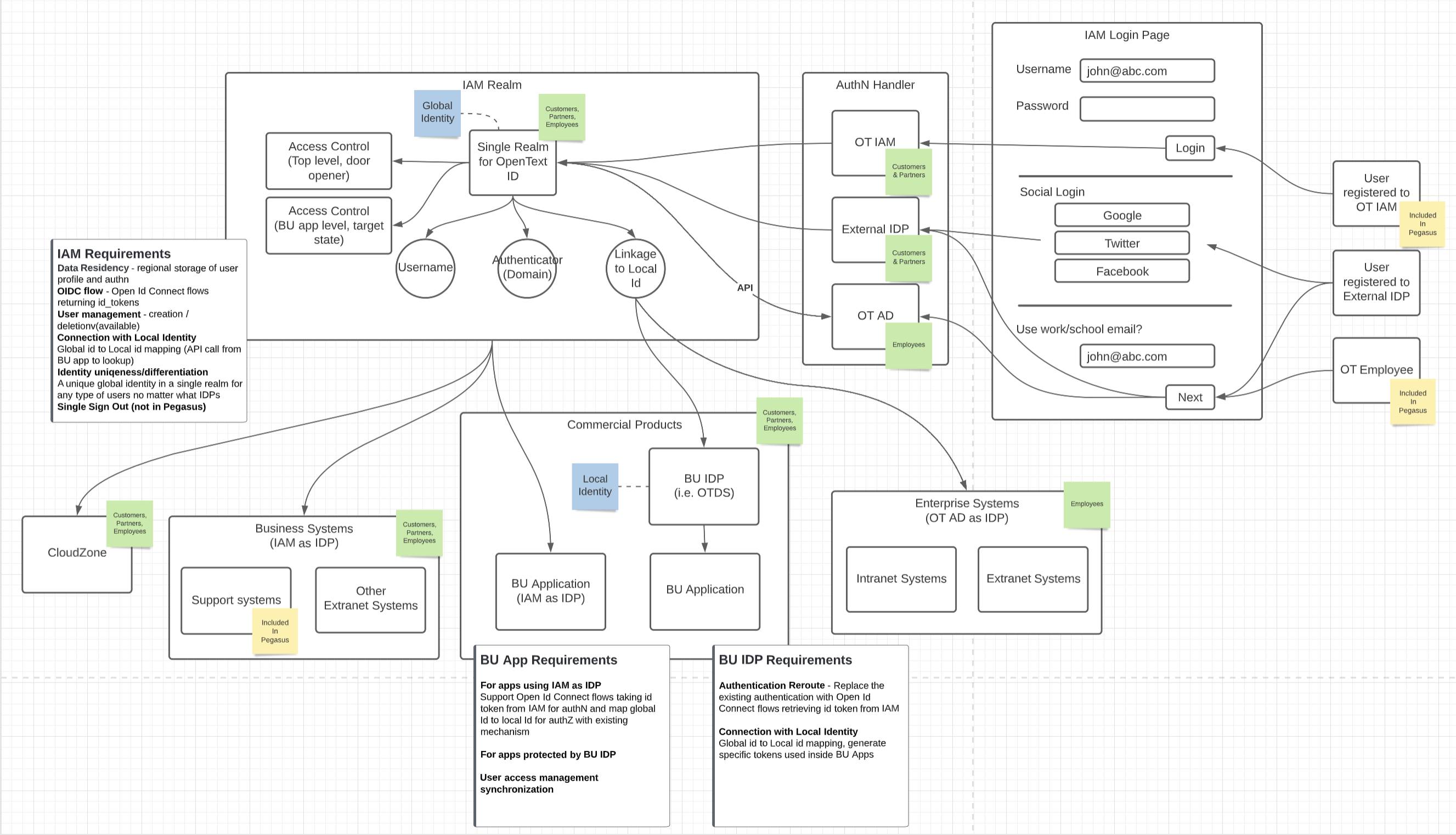
- Integrating product internal information into the system as a personalized experience on the dashboard
- Integrating multiple sign-in process into one, since logging system on www, community and marketplace are all using different third party systems
- Currently we do not have any real support system on anywhere. The main support we have is “Contact Us” through customer service to Sale department.
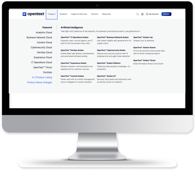
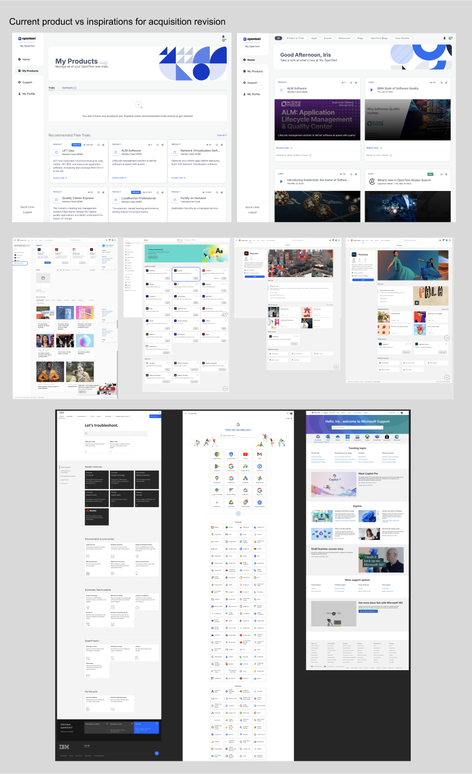
New Acquisition By OpenText
OpenText acquired Micro Focus in 2023, leading to a pause and re-evaluation of most ongoing projects, including this one. OpenText aimed to develop a product management dashboard similar to "My Micro Focus." Fortunately, we were already ahead, having launched the dashboard and conducted several rounds of testing and iteration. Our focus shifted to aligning with the new company's strategic vision, analyzing user requirement differences between the two companies, and rebranding the dashboard to reflect OpenText’s identity.
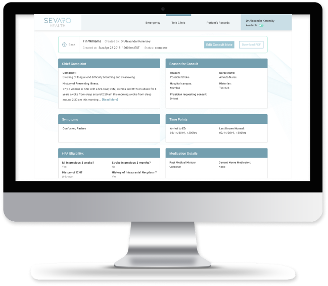
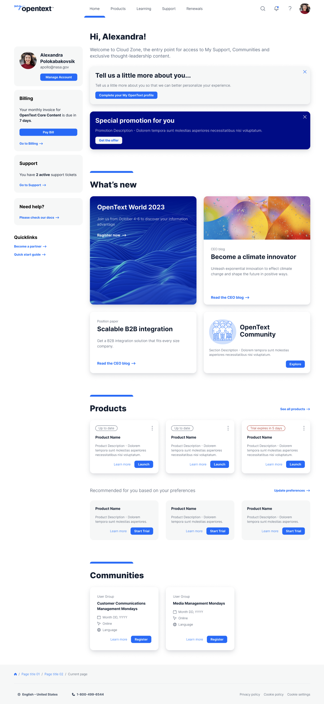
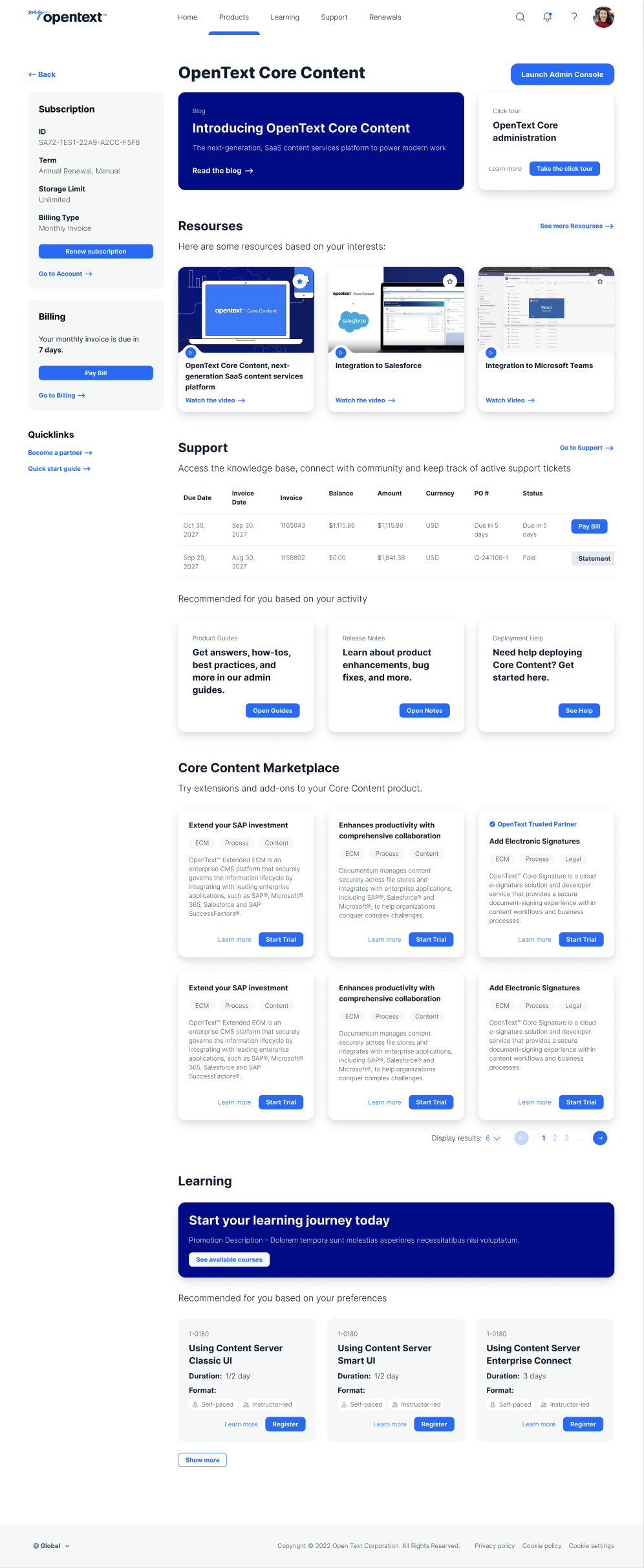
Ongoing Dashboard Project
Some Screens and Process Gallary
Other Projects
Use below links to explore Iris' other product design projects